Citing sources
Since your graphic might be separated from your written piece, it's a good idea to cite your data source(s) on the graphic itself. The bottom left-hand corner is the traditional place for this, in a nice small font.
You can either just name the source or get a little more formal with Data: Wherever or Source: Wherever.
Example
Let's say you're using Sex by Marital Status By Age For the Population 15 Year and Over from the US Census Bureau's American Community Survey. You could cite your data source as...
- US Census Burea
- American Community Survey
- US Census Bureau, American Community Survey
- ACS 2016, Table B12002
It really depends on what looks the best and who your audience is. It's fine if you're vague in your graphic if you're more specific in the written piece.
Directly labeling your data points
Instead of having a key to understand a color or making your user rely on an axis to understand a value, sometimes you can just write the value next to or inside the circle/bar/whatever.
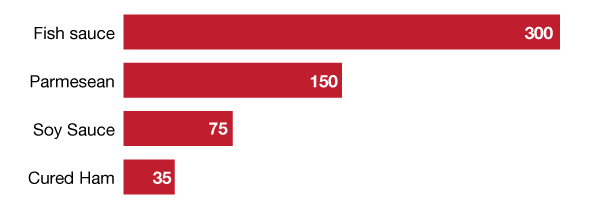
You usually only use this with smaller data sets and/or with smaller numbers - preferably rounded integers. Having to write out something like 34,520 clutters your graph up quickly.
Labeling on the outside
Labeling on the inside in a contrasting color is a fun trick, but you can also label on the outside.

It's especially useful when you need to include units that take up a lot of room, such as "million" or "pounds per year."
Example
For example, you have a bar representing Peru's GDP in 2013. You could have your reader slowly trace a line from the end of the bar down to the axis and estimate that it's kind of a little above 200 billion, or you could just write 202.3 billion at the end of the bar.
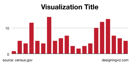
Giving your visualization a title
Most graphics deserve a title. That way when your graphic is cool and popular and being sent around the internet everyone will know just what they're looking at.
Your title should usually be what you want the person to take away from the graphic (the meaningful or interesting part) not just a description of what the data is (the boring part).
If you need to explain what the data is, you can use a subtitle.
Note: You don't need an interesting title if your graphic is very very secondary to the text and doesn't need to draw the eye.
Example
If you're visualizing how expensive Christmas dinner is you might make a graph of the cost of Christmas dinner each year.
You might title that Christmas Dinner Costs Each Year 2011-2016.
Then your editor will change it to Christmas Dinner Costs Rising instead, and she will be correct.
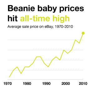
Interesting data sets
If your data set is actually interesting you can use a description of the data as your title.
If you mapped every single step you've taken in the past five years, that's pretty interesting: Every Single Step I've Taken in the Past Five Years would be a fine title.
Standardizing your font sizes
Don't have more than two or three font sizes in the main body of your graphic. Generally you can solve this problem by making sure your annotations the same size as your axis labels.
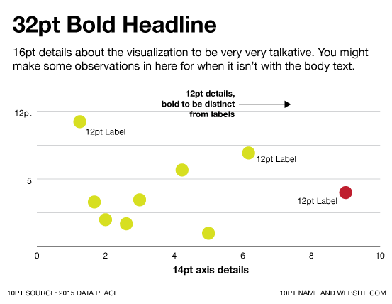
Titles and subtitles don't count towards the number, only axes, labels, annotations, and anything else that's the actual "visualization".
Example
When you're playing around with a new design, it's easy to accidentally end up with
- 42pt title, to make it nice and big
- 16pt description, to make it easy to read
- 12pt anotations, to fit everything in
- 12pt bold annotations, for the more important annotations
- 10pt axis labels, since they're less important
- 8pt tick mark labels, since there are like ten of them and you want them to be really small
That is probably too much stuff. Make the annotations and everything on the axes the same size, and use color or positioning to emphasize the annotations vs. the labels.
Out in the wild
Take this FiveThirtyEight graphics from a piece on Scrabble champ Nigel Richards.
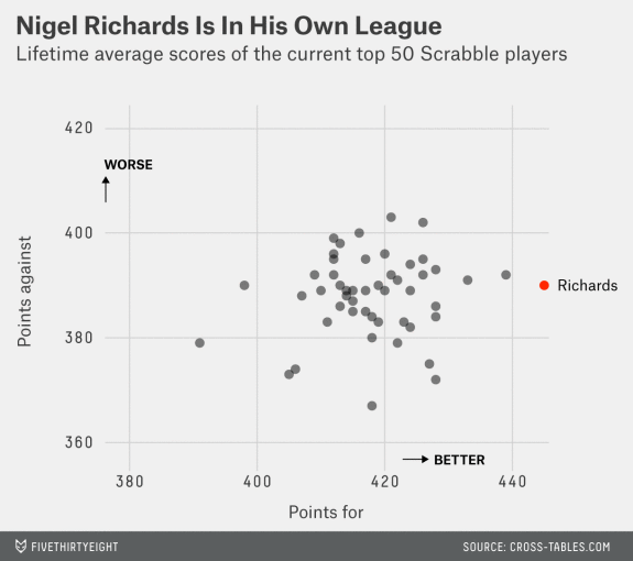
Between different fonts sizes, weights (boldness), and typefaces this graphic has at least six different kinds of text there. They can get away with it because they're FiveThirtyEight - you probably aren't, so stay safe and standardize.
Taking credit
You should always put contact information on your graphics.
Usually your name, website, and Twitter handle are the maximum you can fit in. The traditional position for it is in the bottom right-hand corner (your data citation will be on the bottom left), or you can get a little bolder and put it right under the title.
There's also a tendency to put the credit and source lines in ALL CAPS which is super fine.
Too many labels
If you have a lot of data points and every single one of them is labeled, get rid of some of those labels! They aren't all important, I promise.
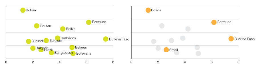
The point of a visualization is you're presenting a curated view of the data underneath. If someone really wants to note every single datapoint, point them towards a spreadsheet.
Other options
Another good solution might be interactivity. It can be a crutch, but if you want people to be able to explore each and every data point, you can make them click or hover.
In the wild
The image accompanying this Vice piece by Spe Chen has a lot of dots but only labels the important ones (outliers + averages + a few others).
Example
You've mapped the 100 largest cities in the world, sizing the circles according to their population. If you've labeled each city with its name, it's too many labels. Heck, if you have twenty circles and you've labeled all of them it's still too many.
Instead, pick the largest (or most interesting) five and give them annotations.
If you'd really like to include the other information, you can:
- Static graphic: Provide a chart to the side of the graphic, listing each city and their population
- Interactive graphic: Allow people to hover over the circles, and get a little hover explaining what the city with population details.
Example
You have a pie chart of city expenditures. The city spends money on 25 different things, but most of the categories are only 0.2% of the budget.
Those super-small slices really don't matter, since they'll be dwarfed by the large categories. Combine them together into an Other category, and explain what the category contains in a footnote.