Removing borders on bars
Make sure your bars and columns are solid colors that don't have outlines around them.
If you happen to have a bar that's the same color as your background, just change one of the colors.
Example
Here's an example from Adobe Illustrator - the default graph has a solid border around each bar.
The borders are supposed to help you... I don't know, tell the bars apart? The bars are separated by space, though, so you can tell they're different regardless.
So I went ahead and set the Stroke to zero, and voila! A much nicer, more modern chart.
The simple bars might clash a little with the current axes, but it's a good start towards cleaing up the defaults.
Ordering bars
You should always order your bars and columns.
Most of the time you should be ordering your bars from largest to smallest, not alphabetically. We're designing for the most popular use case: some people are interested in finding one specific bar, but everyone is interested in knowing what the largest and smallest bars are.
Example
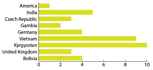
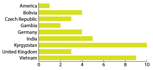
We start with a series of countries, all with some sort of values.
Then we'll go ahead and order them by bar size, not alphabetically.
Some people might want to put things in alphabetical order, but if you're really interested in Bolivia you're probably more interested in how it stands relative to everyone else, not just what the actual number is.
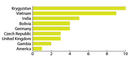
Now that it's ordered you can easily see that Krygyzstan and Vietnam are on top and the US is on the bottom. How interesting!
And Bolivia? Well, you can read through the country names and find it easily enough. Because it's ordered by bar size you can easily see that Bolivia is a little above the halfway point compared to the other countries. If we ordered the graphic alphabetically you'd find Bolivia quickly but would only learn that its value is 4.
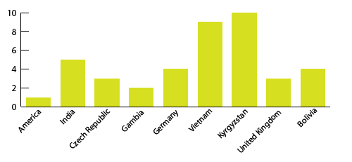
If you don't believe me, here's what it would look like:
Don't use diagonal labels
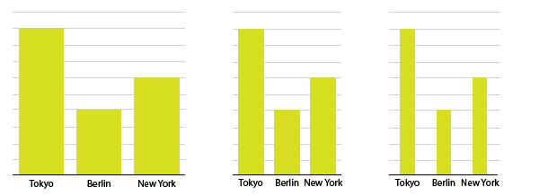
Sometimes you're labeling columns and the names of the labels are just too long, so you get fancy and make them diagonal.
Do not get fancy. Just make the chart use horizontal bars instead of vertical ones, then you can write out the labels in normal, readable, left-to-right fashion.
Example
Country names are notorious for this situation - you usually have a lot of countries and some of them have very long names.
If you turn it into a horizontal bar graph instead of a vertical bar graph, all your problems quickly disappear.
Thinning out columns
Wide bars and columns look clunky - keep your bars thin for a simpler, more elegant look. Too thin, though, and it's tough to compare the bars to one another.
The right width often has to do with spacing and general graph setup. Also, it's usually easy to have thin bars as opposed to thin columns.
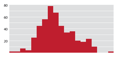
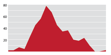
Extra-wide, 100% columns
If you're making a bar graph of values that are one right after the other - a histogram, for example - you can make each bar so wide it touches the bars on either side. This helps convey the idea that there is nothing between one data point and the next.
Some people probably think this is a terrible idea, and it might be.
These are called 100% columns because they take up 100% of the space that they could possibly take up.
Comparison with area charts
Graphs with 100% columns are basically area charts, just using columns to fill in the space instead of colored-below lines.
If you could make a line graph of your data but want to go for bars instead, 100% columns are for you.