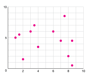
Using full-width grid or tick lines
Use full-width lines with your tick marks when specific numbers are really important.
If your reader only needs to know that A is bigger than B, don't use full-width lines, just use small ticks on the axis. If your reader is going to spend some time with the graphic and be interested that A is 45.65 and B is 37.66, that's when you use full-width lines.
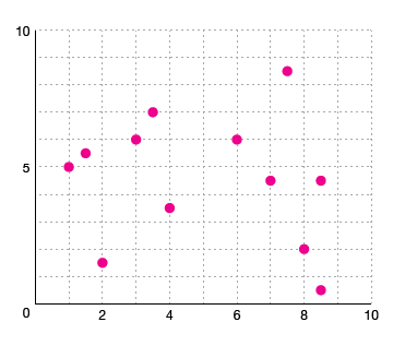
Caveat: A lot of house styles use full-width marks for scatterplots, no matter what's important. It's pretty reasonable - when you're trying to read two axes at the same time to figure out where a point lies, full-width lines can really help with that.
Backgrounding grid or tick lines
If you're using full-width grid/tick lines, you need to make them much less obvious than the dots, bars or lines that are your actual data points. I call this "backgrounding."
The rule boils down to don't make them black lines.

If your background is white(-ish), you should make the lines grey.
You could also make the lines light grey and dotted or dashed.
Negative space grid
You can also make your graph background grey, and make your grid lines white so they're kind of using negative space - or a slightly darker grey because obviously everything ever should be grey.
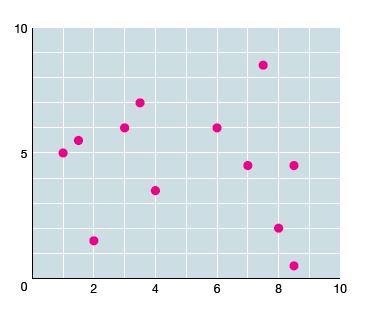
You can still dot them if you'd like!

Thick baselines
Baselines should be thicker or darker than grid lines to provide an anchor point.
Selecting a lower bound
If the lower bound of your axis can be a zero, you should probably make it a zero.
Does that make the change in your data look less interesting? It might be because your data is actually boring!
Selecting an upper bound
One of the aspects of your story that's reflected in your axis bounds is whether the values on the graph are only relative to one another, or are the value also relative to a maximum?
If you're only comparing the values to one another, use the maximum value in your data set as the upper bound of the axis. If you're comparing the values to some hypothetical maximum value, you can use that maximum instead.
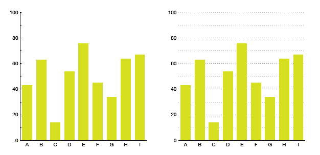
Example
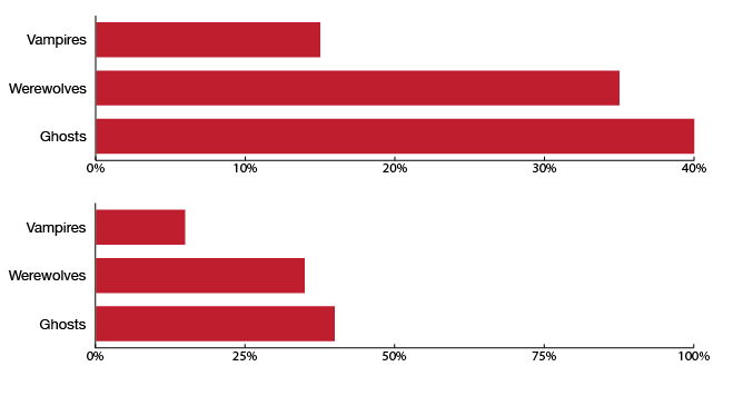
If we ask what people have nightmares about, we might just want to compare different Scary Things to see which one people fear the most (top figure). We could also present those same values against 100%, as we do in the bottom figure. The values can still be compared to one another, but we can also see how close we are to complete Ghost-fear saturation (we're getting there!).
Placing your annotations
While the standard place for y-axis tick labels is to the left of the line, you can also put them on top!
Only do this if you have full-width tick lines - short ones usually won't work out.
It can help pull a graphic into seeming like a single unit, instead of having the text float off in space to the left. I think this is probably more of a style decision rather than a good vs. evil decision.