Rounding off numbers
Instead of picking numbers that exactly fit the upper and lower bounds of your data, round to clean-looking numbers.

This applies to ranges and boundaries, too.
Example
Your smallest number is 8.4, and your largest number is 23,948. Because you value being specific, you put those numbers on your scale.

Unfortunately, it's kind of tough to read at a glance. People like round numbers. Adjust your scale to 0 to 24,000, not because of Science but because of Human Beings.
Example
You've used some sort of magic algorithm to put your content into buckets.

You need a lot of brainpower to parse those hyper-specific numbers! Unless it really, really ruins your display or conveys inaccurate information, change your scale to reflect something a little more human.

Marking boundaries instead of ranges
When building a legend that explains the difference between several colors, you can sometimes remove much of your text by marking boundaries instead of full ranges.
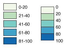
Instead of ranges like "0-20" and "21-40," we're just going to mark the boundaries between the colors. This lets us remove a lot of repetitive text and to merge the boxes together so the legend takes up less space.
Horizontal vs vertical orientation
For numeric scales, a horizontal legend typically scans more easily than a vertical one.
For scales with categories, though, a vertical scale is usually better. With all of the space to the right you're able to write long long text next to each box.
Removing inside boundaries
Maybe the actual numbers on your scale don't really matter, and you're just trying to say "A is more than B is more than C". In this cases like that, where you're interested in a general upward or downward trend, you might experiment with only displaying the maximum and minimum of your scale instead of outlining each boundary or color.

Example
Maybe we start with a scale showing you every single break from 0 to 100.
But maybe the difference between 24 and 55 don't really matter - we're just trying to show a general upward or downward trend. In that case we can simplify the scale to only show the maximum and minimum numbers.
It certainly doesn't give the user as much information, but sometimes that information just isn't necessary.
Removing maximum/minimum values
If you're using a scale for quantitative data (numbers), you can sometimes delete the top and bottom values to simplify your scale.

The basic idea is keep numbers that are important or that your reader cannot guess, and delete anything else.
- If we can be absolutely sure what the bottom number is, we can delete it.
- If we can be relatively sure what the top number is, we can delete it.
- If it doesn't matter what the bottom number is, we can delete it.
- If it doesn't matter what the top number is, we can delete it.
Example
You have a graphic of data points from 0-100, with even breaks.
If we deleted the top and bottom values, it would look something like this:
It looks cleaner, but should we do that? Let's look at a few times you would or would not remove the outer bounds of a scale. This is not a complete list, but it should help you think through your options.
- Being absolutely sure: If we're counting objects, 0 is clearly the smallest number, so we can delete the bottom of our scale.
- Being relatively sure: If the data values above 80 are 1200, 9000 and one million, people can't guess that so we should mark 1,000,000 at the end of the scale.
- Bottom doesn't matter: If we're measuring average temperature in a country, we can assume the reader knows that nowhere is -400°F, and "below 20" is meaningful enough. In that case, we can delete the bottom of our scale.
- Top doesn't matter: Maybe we're mapping wealth in an area, and most people make about $40k. There are a few neighborhoods of rich people, and a few neighborhoods of poorer people. Even though making $500k is a lot more than the average, for this map it might just be considered "much richer than others," and we don't care about the specifics. In that case, we can delete the top of our scale.
Outlining color blocks
If you're pushed your color blocks up against each other, you should remove the outlines around individual color segments. By default your legend might look like this:

Removing the outlines around each color makes your graphic a lot cleaner. You can also use an outer border to separate the legend colors from the graph background.
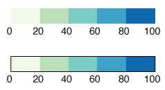
A lot nicer, right?