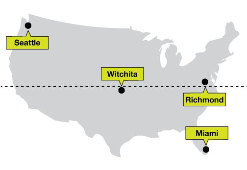
Planning for lazy users
While interactivity is fun and cool and popular and etc, you need to assume your reader will not click or hover. You should generally make your visualization meaningful or interesting without forcing interaction. Interaction should be a bonus.
Adding text annotations or starting your visualization from a post-interaction state are two simple ways of solving this problem.
Tell a story
Your visualization should always have a message. Your job is to curate the data that is being presented to the user; putting down 500 points on a scatterplot or 100 lines on a map and telling users to interact is not good enough.
While the explanation vs exploration spectrum is totally valid, users will usually only want to explore your data once you're hooked them.
Tooltip directions
If you have a tooltip that always shows up above your data point, or is especially wide, you might have issues with the tooltip running off the side of the screen.
A quick fix is to change the direction of the tooltip based on where the data point is: if the data point is on the top half of the visualization, put the tooltip below the data point. If the data point is on the bottom half, put the tooltip above the data point. That way there'll always be enough space.
You can do the same thing with left/right if you need to.
Layering lines
When you have a complex line graph and you're highlighting one of the lines, bring that line to the front so none of the non-highlighted lines cross over it. It an important line (right?) and shouldn't be obstructed.
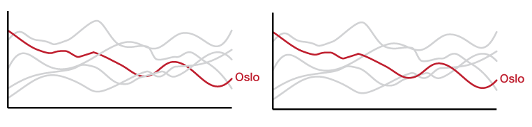
If you're using d3, you're looking for raise.
Dense circles
If your visualization has a dense area of overlapping circles you'd like to hover over, it can sometimes make for a difficult user experience.
To make things easier for your reader, don't wait for the hover event - just find the circle that has a center closest to the mouse coordinates and pretend you're hovering over it.
Close enough should be good enough
No matter what your elements are, they shouldn't be difficult to click on or hover over. If you have to fight your mouse to line things up juuuuuust right, make some changes in how elements are selected. Some options might be:
- Picking the closest point instead of requiring a direct hover/click
- Adding a buffer zone to make your elements' hoverable/clickable area larger (e.g. transparent overlay)
- Adding separate tools for selecting data points (dropdowns, filter menus, etc)